

SOLUTIONS

Working together, we will guide you, as we have so many other small businesses, in developing and promoting brand recognition. We will identify and provide the tools necessary to increase and enhance communication between you and your customer to increase your competitive edge in the marketplace and escalate sales.
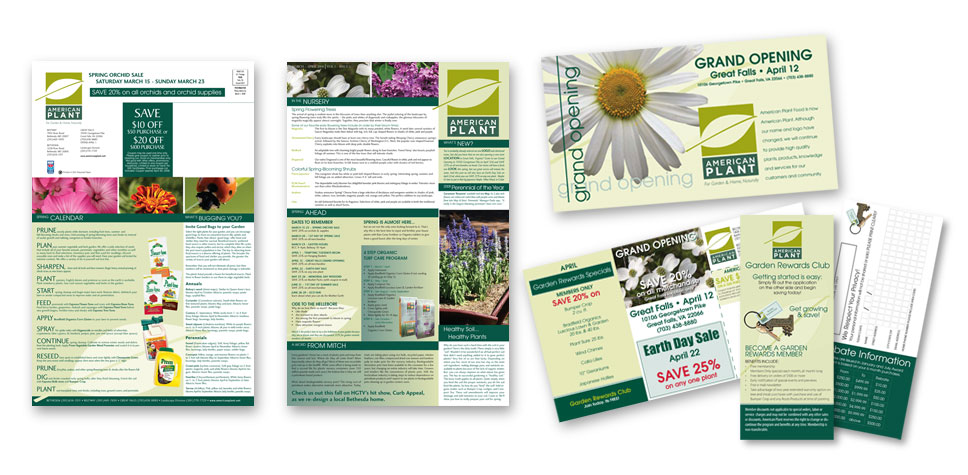
American Plant
Situation: American Plant Food, an independently owned garden center in the Bethesda, MD market outside of Washington, DC, decided in 2000 to commit to selling only earth-friendly gardening products and to educate their customers in product usage. This 80-year-old-business, with two locations, required a new look to convey this message more clearly to consumers.
Solution: Along with a new logo designed to convey a clean, crisp, organic look and feel, the business name was also changed from American Plant Food to American Plant. The retailer’s loyalty program and other marketing materials were also redesigned to solidify their updated brand.
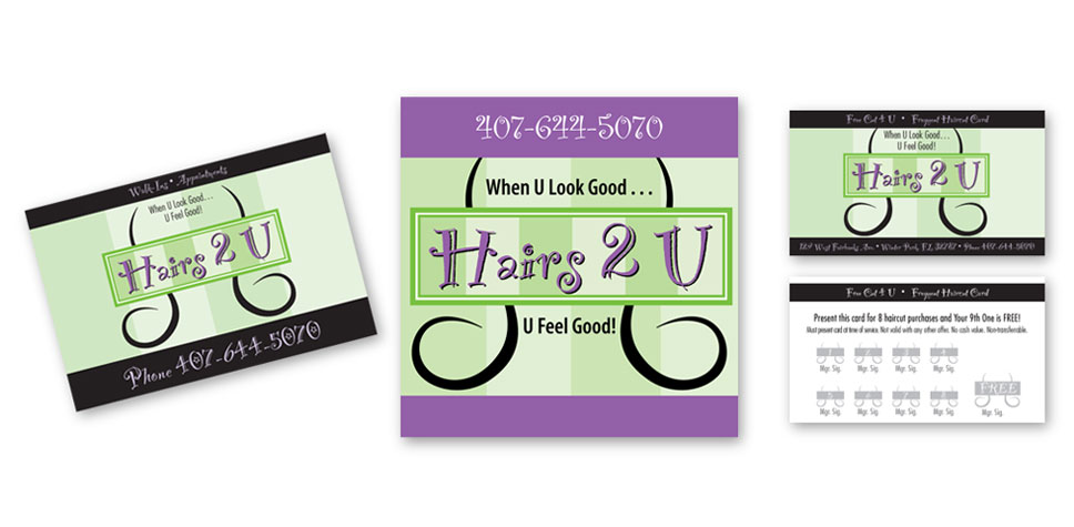
Hairs 2 U
Situation: Hairs2U was just starting up in a very affluent college town. They needed an image that would be appealing to the college age crowd yet still convey their upscale services and offerings.
Solution: Solutions Marketing Group chose a color scheme and designed a logo that would appeal to the varied local market. A uniform campaign was then executed, in the new color scheme, in order to solidify the new brand. A mail list was purchased, introductory literature mailed, and the image delivered.
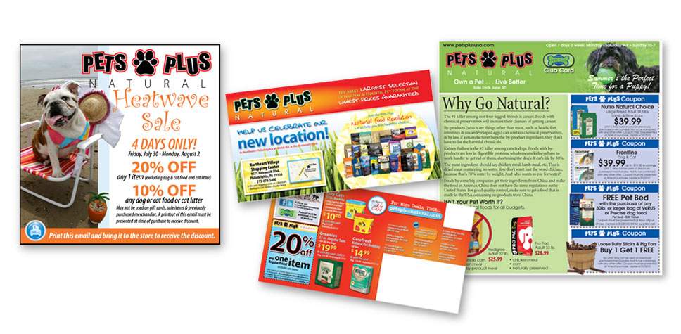
Pets Plus
Situation: Pets Plus, a Philadelphia-based, independently-owned pet store with 10 locations in the PA & NJ area, saw a decline in sales while advertising their business through the use of traditional circular inserts in local newspapers. A fresh marketing image was also desired.
Solution: Solutions Marketing Group recommended and implemented two postcard mailings. With the owners very pleased with the results, a new clean, fun, humorous look was developed by Solutions Marketing Group to compliment and reinforce the company's slogan “Own a Pet, Live Better”. A customer list, generated from eight established stores, and purchased list, based on income & pet ownership from 2 newly opened stores, provided a great tool to encourage customer loyalty. A monthly postcard program was developed using various seasonal & holiday themes to convey a fun, fresh, family-oriented message.
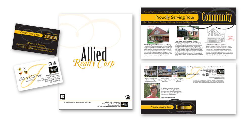
Allied Realty Corp.
Situation: In the highly competitive field of real estate, Allied Realty was located in an up-scale and expanding market. They wanted to get across their experience and dedication to the community in a business that very often is focused on the money rather than the client.
Solution: Our team redesigned Allied's marketing materials, emphasizing community, and worked with them to develop a neighborhood guide highlighting local attractions. Personal stationary and other identity materials were developed to give the customers a feeling of personal contact with their realtor.
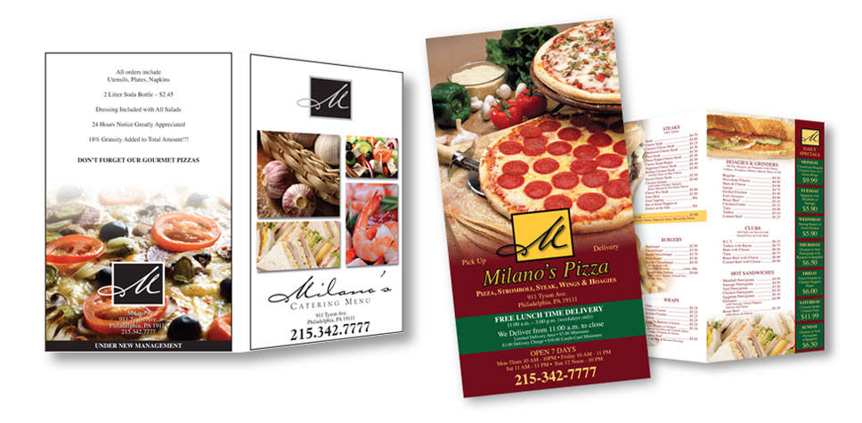
Milanos
Situation: This Northeast Philadelphian Italian restaurant desired a new look when it came under new ownership/management. The restaurant’s previous logo image was generic. The new owner also desired to promote their catering aspect of the business in a more professional manner.
Solution: An upscale logo was developed to convey the new look and goals for this business. A standard restaurant menu and a separate catering brochure were developed including the new logo.
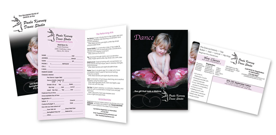
Paula Kearney Dance Studio
Situation: Paula Kearney Dance Studio began to notice that traditional newspaper ads were no longer bringing in new customers.
Solution: We identified the client’s target audience: girls between the ages of 3 and 15, within a 5 miles radius of the studio. We provided a mailing list with these demographics for households with a $50,000 income and above. Even though it was the mid-season, a postcard mailer with a fresh image was sent out in late December to attract new customers for the upcoming spring recital season. The postcard was a big success, bringing in many more students than the client had imagined. Highly successful, the promotion paid for itself several times over. Later, a tri-fold mailer and another series of postcards were developed to target potential customers as well as retain current dance families.
MANTS (Mid-Atlantic Nursery Trade Show)
Situation: This client sought out Solutions Marketing Groups expertise in website development. It was becoming increasingly difficult for the client to manage this very important industry trade show with outdated technology along with a stale brand.
Solution: Our team provided MANTS with an interesting and colorful new image. We developed a Word Press, Content Management System website, and provided training for this easy to use technology that allow the MANTS staff to update website text and images 24/7/365.
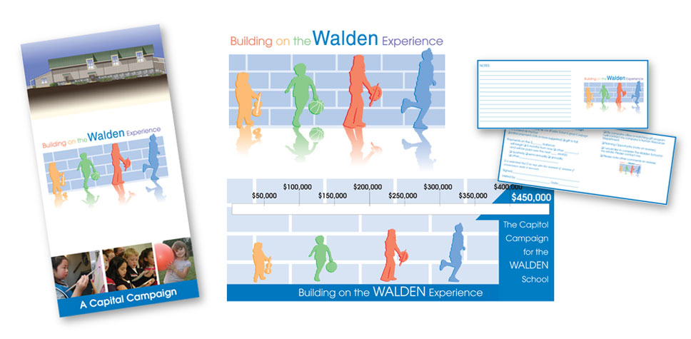
The Walden School
Situation: The Walden School was kicking off a capital campaign to build a multi-purpose building providing students with a new gym, art room, stage, music room, kitchen, restrooms, and open lobby display area.
Solution: A new logo and slogan were created to celebrate the past history of this private Montessori school and highlight the new experiences the building would offer. The logo was designed with different colors and sizes of children to symbolize the diversity of the school population and bring to attention the excellent pre-school, elementary and middle school education offered by Walden School. The graduated size placement of children also conveyed growth of the child. Each figure represents an activity that a child will enjoy in the new facility. The brick background was used to convey the building. The slogan "Building on the Walden Experience" completes the logo, tying in the current rich education experience the Walden School offers and the promise of an expanded education opportunity provided by the new building. After this important identity was created, all other marketing pieces fell into place.
We have what it takes to grow your small business
